|
| |
Dan Mogford speaks about his latest assignment, designing the covers for John Gardner's 007 reprints - plus a look at the final covers...
|
|
Gardner Covers Interview
26th May 2012
Dan Mogford has over sixteen years experience in designing for the publishing industry. After completing a Graphic design degree at Central Saint Martins, Dan worked at Pan Macmillan followed by a four year stint with design studio The Senate. Since going freelance in 2000 Dan has worked for a wide range of clients in the UK and abroad from small independent publishing houses including Verso, Icon and Granta to Random House, The Orion Publishing Group and Penguin. He was recently responsbile for designing new covers for John Gardner's James Bond novel, re-released in 2012.
Would you tell us how you got involved in the John Gardner reprints project and what initially attracted you to the job?
I was approached by Steve Marking an Art Director at Orion to see if I would be interested in pitching some design ideas, I believe they were putting forward a few different approaches both from the in-house design team and freelancers like myself. It was immediately appealing to me as I've always been a fan of the Bond books and movies. Of course the Bond books, be they Flemings, Gardners or others have had a multitude of different cover treatments over the years and the opportunity to try something different was irresistible!
How much freedom did you have when composing each cover and what, if any, guidelines did you have to follow?
Once the overall look for the series was established it was just a matter of selecting an appropriate icon to represent a key plot element for each book and then a suitable colour pallet to distinguish each novel. The design template I came up with was purposely quite rigid so the elements which change form cover to cover were limited. The only other guideline from the Ian Fleming Publications side was the use of the approved 007 logo which features on all the spines.
Did you read each novel for inspiration or how did you decide on the icons that would be used on each cover?
Because of the sheer number of books and the relatively tight schedule it wasn't possible for me to read them all. I relied on the excellent plot summaries on MI6-HQ.com and other internet sources as well as the in-depth knowledge of Orion's editors.
Which was the most difficult cover to conceptualise?
None were particularly tricky, the books are all so full of fantastic details and plot devices there was always some great visual element that jumped out. |
|
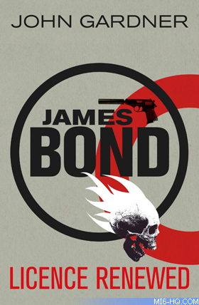
Above: Cover art by Mogford for John Gardner's first 007 novel, "Licence Renewed".
|
Which cover did you design first and how many variations did you go through before you found the one you and the publishers were happy with?
The first to be finalised was Licence Renewed closely followed by Icebreaker and For Special Services. These were also the three I used to present my initial pitch for the series design to Orion and changed very little from that first presentation to the finished covers, I think there was some debate about the style of the Iron Cross on Icebreaker and a request for more fire on the flaming skull of Licence Renewed, otherwise relatively plain sailing!
|
|
What was the length of time you spent on each cover beginning to end?
They all varied but I would generally spend a good half day researching the plots and generally getting sucked into the plethora of online Bond resources! Then another few hours of picture research to locate a suitable image for the cover icon. As the template for the covers was established at the beginning of the whole process the actual artworking stage for each was relatively painless.
Can you describe the processes you go through to create the cover, what mediums do you work with?
The covers are created entirely digitally but I wanted an element of texture and a slight vintage feel to shine through so the background of each cover is a scanned sheet of rough textured paper. The covers themselves are then printed on uncoated (non-glossy) board which has a good tactile feel, with a clear shiny foil on the key elements for an extra dimension.
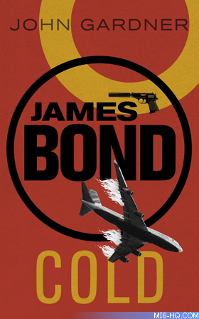
Right: John Gardner's 12th and final 'original' Bond novel, designed by Dan Mogford. |
Are you a fan of the James Bond novels and which do you count as your favourite?
As a teenager (in the 1980s) I devoured all the Ian Fleming novels and one or two of the Gardners (I remember the supremely garish covers!) I'd be hard pushed to name a favourite but Live and Let Die coupled with the movie experience is pretty memorable!
Does designing for the James Bond franchise present any particular challenges?
I was fortunate in that Ian Fleming Publications who look after the whole franchise were very receptive to the design direction I took from the start. The covers also seem to have been generally well received by the legions of - often quite vocal - Bond fans. As a book cover designer I'm really glad I got the opportunity to work on such an iconic set of books and hopefully do them justice...
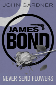
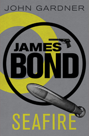
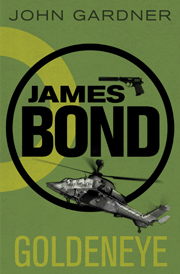
Above: Three of the four final 2012 John Gardner covers that were revealed this week.
 2012
Gardner Reprints 2012
Gardner Reprints |
Many thanks to Dan Mogford. You can see more of Dan's work at www.danmogford.com.