 |
| |
MI6 caught up with illustrator Michael Gillette
to talk about his art and typography for the newly
republished series of James Bond novels by Ian Fleming... |
|
Designing 007's New Covers - Michael Gillette
Interview
27th February 2008
On 12th January 2008, artwork
for all 14 of Ian Fleming's 007 publications in the 2008 Penguin
imprint was revealed. Set for release on May 28th 2008, to coincide
with Ian Fleming's centenary
celebrations, these Penguin hardbacks were revitalised with
new artwork from Welsh-born illustrator and artist, Michael Gillette.
Recently, MI6 caught up with Michael Gillette to discuss his work
on Bond and in the graphic design trade.
|
Would you tell us how you got involved in the Ian Fleming Centenary project and what initially attracted you to the job?
I got a call from Jon Grey, a designer that I knew socially from my time in London. He told me the general idea for the project - typography on naked ladies' backs, hard to say "no" to that! It's an iconic job, so I was very glad to be asked, quite an honour.
How much freedom did you have when composing each cover and what, if any, guidelines did you have to follow?
Well, the format was very restrictive, but within that I had a fair bit of freedom. Occasionally there was a specific instruction, but not too often. The Bond Estate won't allow nudity, so that's why there are so many backs! No nipples for sure. Penguin and Jon were very supportive of the way I took it.
Are the cover designs inspired directly by the text, if not where were the strongest influences from?
The directive was to keep them filmic - they obviously reference the classic 60s/70s cinematic Bond rather than the 50's literary Bond. I'm aware that there is quite a difference. The films are foremost in people's perceptions of Bond, so it's understandable that Penguin would want something that will bring filmgoers to the books. |
|
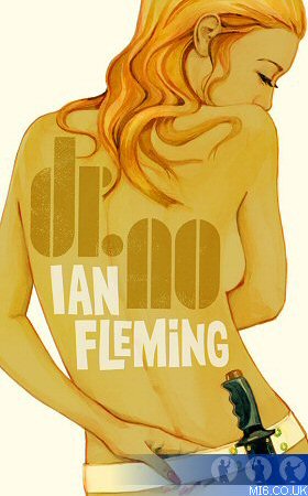
Above: Michael Gillette's artwork for Fleming's 6th Bond novel, "Dr. No", which celebrates it's 50th annerversary this year... |
Only a couple are very specific to the text. In "Dr. No", he describes her as the "Birth of Venus" seen from behind, but with the buttocks of a boy - ah, the English public school system! I'm sure Bond purists will cough up a kidney at the inaccuracies, but it was really more about creating archetypes of Bond, rather than direct representations of the stories.
How did you visualise each cover?
I work in a variety of ways - they are amalgams - unidentifiable as anyone specific. They are very designed, but still hopefully look natural. I'd decide on a type of girl and take it from there.
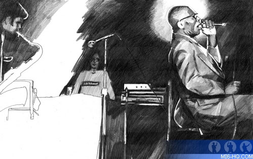
Above: A blues-driven pencil sketch
by Michael Gillette |
Was there always the intention to keep the artwork close, in theme, between one cover and the next or did designing one inspire the next?
Yes, the intention was to keep them close. The challenge was to make them work as a whole, something that when displayed in a bookshop, would grab you from a distance, and then it'd be nice to buy a few of your favourites. I decided that the differences should spring mainly from the colour and the type style. I wanted them kept simple, nude for the most part, the adornment really is the type. I knew that there had to be certain iconic Bond women involved so that inspired some of them.
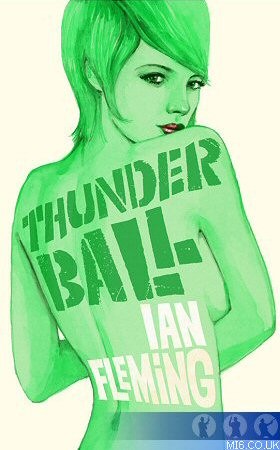
Above: Gillette's artwork for the sub-aquatic 007 adventure, "Thunderball"... |
|
Which was the most
difficult cover to conceptualise?
Penguin insisted on a green one, which was harder to make work than the more natural skin tones; people start to look ill, or alien, so I really resisted doing "Thunderball". Some of the colours demanded that I paint them in a different ways, which forced me to adapt my technique.
What was the length of time you spent on each cover beginning to end?
I did them over the course of 3 months, around some other projects. The longest took 5 days. I did 3 of them in one week during a purple patch. The type often took longer than the girl. Penguin wanted them all finished by 28th Jan, God love them.
What would you say was your major inspiration(s) in your work, both on James Bond and elsewhere?
I've always been inspired by pop art and pop culture. This was a job where I could indulge that to the hilt. I was trying to distill all the things I'd enjoyed about Bond and impress those times in to the various women and the typography - psychedelic posters, Saul Bass, Milton Glaser, films, pop music, it's all in there. The task in hand was definitely to do something that was within a tradition, not to reinvent the wheel, but to make the best set of wheels that I could. |
You�ve commented previously that your first love was music. Did you work on the Bond covers whilst listening to music, and do you find any of your artwork becomes effected by what you listen to?
Yes I did. I probably listened to all sorts over the course of it, but I did listen to a lot of John Barry and other soundtrack stuff from the 60's. I listened to Barry's scores to "Petulia" and "Boom" a lot, Dudley Moore's soundtrack for "Bedazzled" too, and I always listen to plenty of psychedelic music. Sometimes it'll have an influence, but generally when I have an idea, I can listen to the most unsympathetic music and it'll remain pretty solid.
Do you see yourself as an illustrator or as an artist?
I try to do the most appropriate work for the idea in hand,
a job like this is very squarely an illustration job,
a classic of it's type really.
Sometimes I do entirely
self-initiated projects, those are more fine-art based.
I guess it depends on what I'm working on. I basically
think I'm a commercial artist 'cos I don't have any
other means of support.
Are you a formally trained artist - if so, where did you study and how did this effect you artistic style and techniques?
I went to Kingston, but as with most people who went to a British art school, formal training would be a bit of a misnomer, my techniques are all pretty much self-taught.
Right: Michael Gillette |
|
 |
What artistic mediums do you prefer to work with and did you ever consider a different style to what we ultimately see on the Bond covers?
It is for me, about finding an appropriate media for the work in hand. These were done as watercolours and then manipulated a little on the computer, but basically all handmade. I tried a couple of different approaches, I did "Casino Royale" first and then redid it again at the end as I'd drawn her in coloured pencil initially and it had a different vibe - it looked more 50's.
 |
|
Do you find working on a small scale easier than large scale - for example, the difference between a CD cover and a billboard is immense? What types of illustration are easiest, most challenging or most rewarding?
During the making of the Bond covers, slap in the middle actually, I did a billboard project for Nokia which is on bus shelters, buses and hoardings and I approached that in an entirely different manner. I made it out of old 19th century etchings reconfigured into modern headphones. There are logistical headaches to producing large-scale art, too tedious to go in to. Producing a book jacket is obviously a very different thing. Book jackets should be little objects of beauty that you enjoy having around on your table - tactile little jewels. As for preference, of course there are financial considerations! A billboard is going to pay a whole lot more than a book over, and CD's these days, are more of a labour of love. You know basically your artwork is going to end up 2 cm square on iTunes.
Left: Gillette's advertisement
for Nokia's next-generation mobile phones... |
How does your work designing cover art compare to working for some of the other worldwide organizations (Levi, NTV etc) on your impressive resume and which style of marketing is most rewarding for the artist?
I left college in 1992 and have done a lot of different kinds of art. The Bond covers were very enjoyable to do, it's something that as a kid, I would have thought was what illustration was all about. I don't know about the most rewarding as far as marketing goes.
Would you tell us a little about any upcoming projects do you currently have on your plate?
I've just finished some tees for Levis here in San Francisco, and I'm working on a book of my own work.
Related Articles
 New Fleming Hardback Covers
Ian Fleming Centenary Plans
Penguin Plans 007 for 2008
 Ian Fleming Literary Coverage
Thanks to Michael Gillette. All original artwork © Michael
Gillette.

