 |
| |
MI6 caught up with artist and writer Mike Grell to
talk about his James Bond comic series "Permission
To Die"...
|
|
Mike Grell Interview (1)
16th February 2005
|
How did you start out as an illustrator and writer?
I has always wanted to become a newspaper strip cartoonist,
a field where it's much more commonplace for artists to
write their own material.
When I started at DC Comics, I showed Julie Schwartz a
plot for a green arrow story and persuaded him to take a
chance. Elliot Maggin did the dialogue from my plot. Then
I created, wrote and illustrated the warlord, which established
me as one of a handful of writer/artists. Not that there
weren't others capable of doing both, it's just that I pushed
a little harder at a time when it was more rare.
How did you end up working on your first James Bond
comic “Permission To
Die"?
I was approached because of my work on "Jon Sable,
Freelance" and my recent series "The Longbow Hunters".
Who could turn down an offer to do James Bond?
|
|
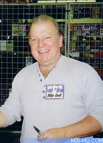
Above: Mike Grell, writer and artist
of "Permission To Die" |
How would you describe your style of artwork?
A bastardization of every influence I ever had. Early on,
I wanted to be the next Neal Adams, then Burne Hogarth. Then I
discovered Joseph Clement Coll, illustrator of many Arthur Conan
Doyle books, and everything changed overnight. Mix liberally with
Paul Calle (author of "The Pencil") and stir in a bit
of wildlife painter Bob Kuhn and you come up with Grell. It's
an evolutionary process. Anyone who's drawing the same today as
he did twenty years ago has stagnated.
How did you adapt bond to your style for the mini series?
I tried to think in terms of dynamic visual storytelling
first, pretty pictures second.
Did you read any of the 007 newspaper strip comics before
or after your work on “Permission To Die?”
I read them before doing “Permission To Die”,
but haven't seen them recently. Wonderful stuff.
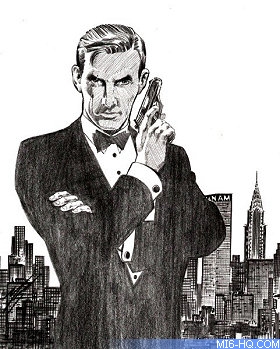
Above: James Bond against the New York
skyline by Mike Grell. |
|
When you began to think about creating
an original Bond mini series, how did you go about this
process?
I approached it as if I were writing a movie. It had
to be contemporary for the times, with exciting action by
comic standards as opposed to film standards (the ramp-to-ramp
jump in "The Man With The Golden Gun" was spectacular
on film, but would have only been three rather boring panels
in a comic) and the kind of unique characters typified by
the classic bond villains and co-stars.
How did you arrive at the title for the mini series?
It's a play on titles from other bond stories, such
as "License To Kill", and a very military approach
to the situation.
I turned it into an exchange between Bond and Major Boothroyd,
who tells him, "your double 0 designation is a license
to kill... No one's given you permission to die."
|
How did you come up with Wiziadio's scheme to create a nuclear
catastrophe to cause global disarmament?
I wanted to create a more multi-dimensional villain, one
whose motive might be for the good of mankind, but his methods
are monstrous.
You revisit the gypsies and an adapted Little Nellie, was
this always the intention or did it develop over time?
One of the staples of any Bond story is the gadgetry. The
mini-helicopter in this story was actually being sold through
a catalogue outlet at the time. The gypsy camp was natural, once
I decided to place bond in a part of the world he had already
visited in "From Russia With Love".
|
Can you tell us how you decided on your covers and
inner seam illustrations for each issue?
Covers are tricky, because you have to sell the entire
series with the first cover. After that, you can play around
with design and content a bit, but that first cover had
better be a movie poster.
For the inner seam illustrations (the two-page spreads
where the illustration cross both pages), it's a simple
matter of deciding which scenes are the most dynamic (explosion,
climactic action, etc) and making them the biggest panel
on the page.
I also make it a point to turn the page to the revelation,
rather than have the climax of a scene happen in the middle
of the page.
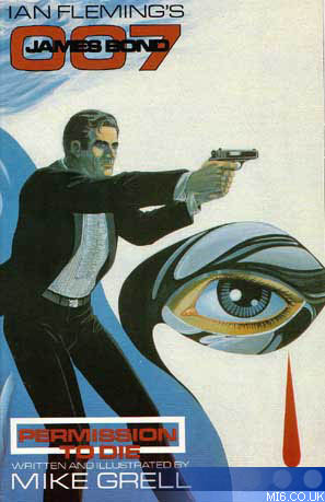
The third cover is a lighter tone. How did this come
about, compared to your earlier two covers?
I was thinking "water" and playing with the
red teardrop against the white mask.
Right: The front cover artwork for
issue #3 of "Permission To Die", released in 1991.
|
|
 |
Of the three issues which was the most challenging?
The first act of a story is always the most difficult, because
you have to establish everything from the ground up. You can't rely
on your readers to have the same background knowledge as you, so
you have to educate them as you go along, so to understand the internal
logic of the story. In addition, you have to design everything,
sets, props and costumes from scratch.
Related Articles
 Mike Grell Interview (2)
"Permission
To Die" Coverage
"Permission
To Die" #1 Review
"Permission
To Die" #2 Review
"Permission
To Die" #3 Review
Many thanks to Mike Grell. Images courtesy Eclipse Comics,
MikeGrell.com
and Rimis London.

