Reflections In A Golden Campaign
28th November 2015
As 'GoldenEye' celebrates its 20th anniversary, Nicolas Suszczyk looks back to the film's poster campaign
The return of James Bond in 1995, with Irish actor Pierce Brosnan portraying the secret agent for the first time, was presented with a stunning visual impact of black, yellow and red. It delivered one effective message: James Bond has returned.
Over the years, the poster campaign for the Bond films has excelled by showing the hero atop of the Golden Gate, surrounded by girls on a scuba suit or pointing his gun underneath the legs of an imposing girl with a crossbow. That was the era were artists like Bob Peak, Robert McGinnis or Daniel Gouzée brought moviegoers to the screen every time a new Bond film was shown.
The 1990s introduced a very common element used nowadays: Photoshop. Hence, the visual campaign for the 17th James Bond film 'GoldenEye' took full advantage of the then very modern tool by creating fabulous composites of shots taken by photographers Terry O'Neill, Keith Hamshere and John Stoddart. The result was, as Roger Moore would have put it, was "a feast for the eyes."
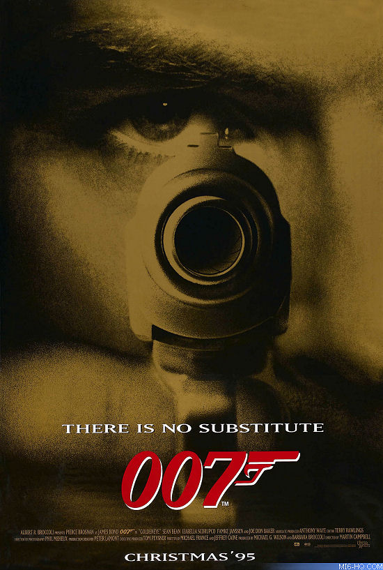
Above: US One Sheet Teaser
The promotional artwork was very relevant in the film's success and -particularly- in the return of 007. After a six year and a half hiatus of the series, Ian Fleming's secret agent needed a solid return as well as a powerful and extensive commercial campaign to fight the blue-neck action men portrayed by Mel Gibson, Arnold Schwarzenegger and Bruce Willis.
Bond also had to fight himself: 1989's 'Licence To Kill' saw relatively poor sales at the box office, poor reviews in the press and a poor marketing campaign, set in the 'Die Hard' style and far from the glamour that characterized the secret agent.
'GoldenEye' perfectly achieved the introduction of the James Bond poster artwork to the digital era. The hand drawn posters would always be missed by the nostalgic fans, but the photo collages proved to be effective enough to rival the brilliant work of McGuinnis, Peak and Gouzée.
Just like in the case of Timothy Dalton in 'The Living Daylights', the marketing department team directed by Gordon Arnell and John Parkinson focused in the figure of the new Bond, producing two teaser posters for different markets.
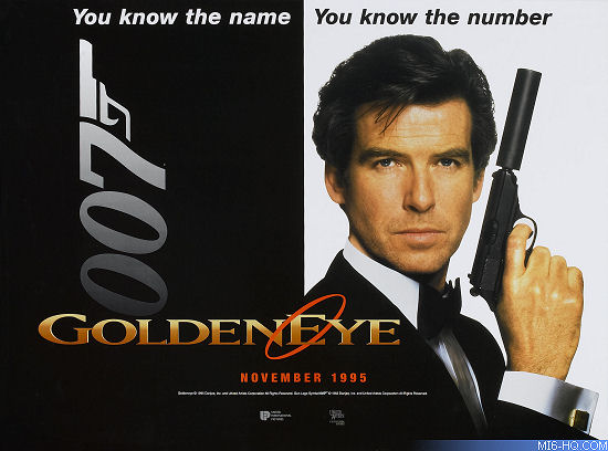
Above: UK Quad Teaser
An advance version was seen in the US designed by Randi Braun and Earl Klasky, from the InSync + BelmisBalkind agency, a team that would return for 'Die Another Day' in 2002. A gold-hued close up of Pierce Brosnan's eye pointing his Walther PPK handgun was offered, using as key material an image taken by John Stoddart. "There is no substitute," the tagline read followed by the classic 007 gun symbol logo in red. The title of the film was absent - in the similar fashion that 'The World is not Enough' and 'Quantum of Solace' would repeat years later- maybe because the image itself remitted to a "golden eye".
On the other hand, the International theatres got the European version, that was less sophisticated but still very effective: Terry O'Neill's photo of Pierce Brosnan, tuxedoed and holding a his silenced weapon next to a 007 logo, framed by a black and white background - another tagline was used: "You know the name, you know the number", in a probably unwanted nod to a Beatles song. In this case, the logo was finally presented: the film's title with a circle around the capitalized 'E' of 'GoldenEye'.
The film's title logo had some interesting changes. Back in 1994, when the film was announced, it featured the Alberta typography until MatrixWide, created by Émigré Graphics in 1990, was then used for the definitive logo that could be seen in a gold, metalized texture in some posters and in a more opaque version in other artworks, with the circle in red.
Celebrity photographer John Stoddart, who had previously worked with Brosnan for a Brioni photoshoot, took many photos of the new 007 and his trusty sidearm next to his girls Famke Janssen and Izabella Scorupco, who played femme fatale Xenia Onatopp and the innocent Natalya Simonova, respectively. Many of these images were also used in trade advertisements promoting the film on magazines or newspapers, showing Bond holding his famous gun and the girls around him in many positions.
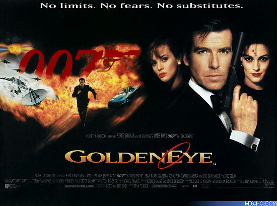
Above: UK Quad
In a recent interview with The GoldenEye Dossier, the photographer recalled that the challenge of working with a new Bond was "far too exciting" and that his directive for the session was, simply, "Bond, girls and guns".
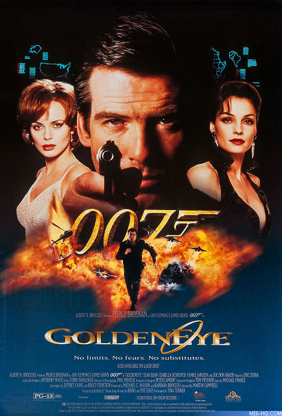
The theatrical poster for 'GoldenEye' featured Brosnan with his girls. Below the main cast, a red 007 logo was surrounded by explosions and scenes of the film: Bond's new car BMW Z3, satellites, a Cessna plane on fire and about to crash and - prominently - the image of 007 running on a commando outfit, all of it beautifully contrasting with a black background in a composite of publicity stills taken by Terry O'Neill, John Stoddart and Keith Hamshere.
The European version, also distributed to international markets, reused the shot of Brosnan with his silenced Walther PPK by her side, taken by Terry O'Neill, while the headshots of Izabella Scorupco and Famke Janssen were taken by John Stoddart. The collage seen at the bottom of the poster was made of film stills taken by long time Bond photographer Keith Hamshere.
An alternate version of the same poster was released on the US market: the three principal figures were given a golden hue, and Terry O'Neill's shot of Brosnan was replaced by another one by John Stoddart, featuring Bond aiming with his Walther handgun.
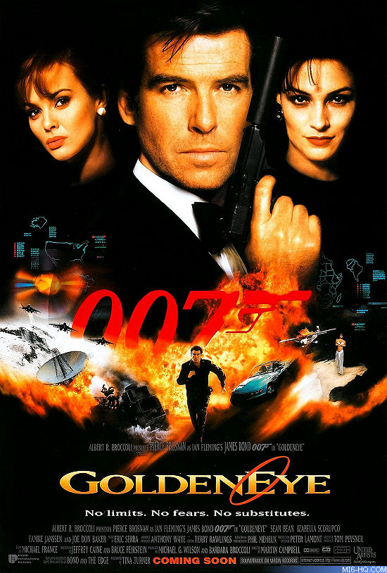
Above: US International Advance
Both posters used the same tagline: "No limits. No Fears. No substitutes." A fascinating approach showing us James Bond could stand tall in a new era, and reminding the moviegoers he was not a hero of yesterday, but a hero of the present time.
In Japan, where Bond posters had also original and distinguished artwork, 'GoldenEye' also excelled by offering a composite that mixed elements of the international teaser and theatrical poster designs, with Brosnan's image by Terry O'Neill and two Keith Hamshere stills of the leading ladies. Two versions for the Nipponese market were produced, with very slight differences: one of them offered Bond's BMW Z3 on the bottom collage while the other one featured Xenia's Ferrari 355. The shots of Xenia and Natalya were different on each version.
The 'GoldenEye' campaign set the style for the following Brosnan films: many characters featured (the hero, the girls, the villains), most of the action scenes and chases and very colorful and eye catching, a trend that was considerably put aside in the Daniel Craig films starting with 'Casino Royale' in 2006, with very little of the characters and the film plot was seen in the designs, and the palette used was close to monochromatic or with very few shades of color.
Above: Promotional DVD Poster
As much as the decades can change and the movie posters become everyday more minimalistic, the artwork for the 1995 film will always remain among the fans favorites and will always stand out in any poster gallery. Just like the film itself, it clearly represented an era where action movies were meant to provide the audience a thrilling ride that would start way before they got into the theatre.
The poster campaign truly characterized 'GoldenEye' as a part of the 1990s, a part of the action genre and, most important, a part of the James Bond movie series - a James Bond that was also coming back to life in a financial and artistic way.


